


PROFOUND FITNESS
BRIEF
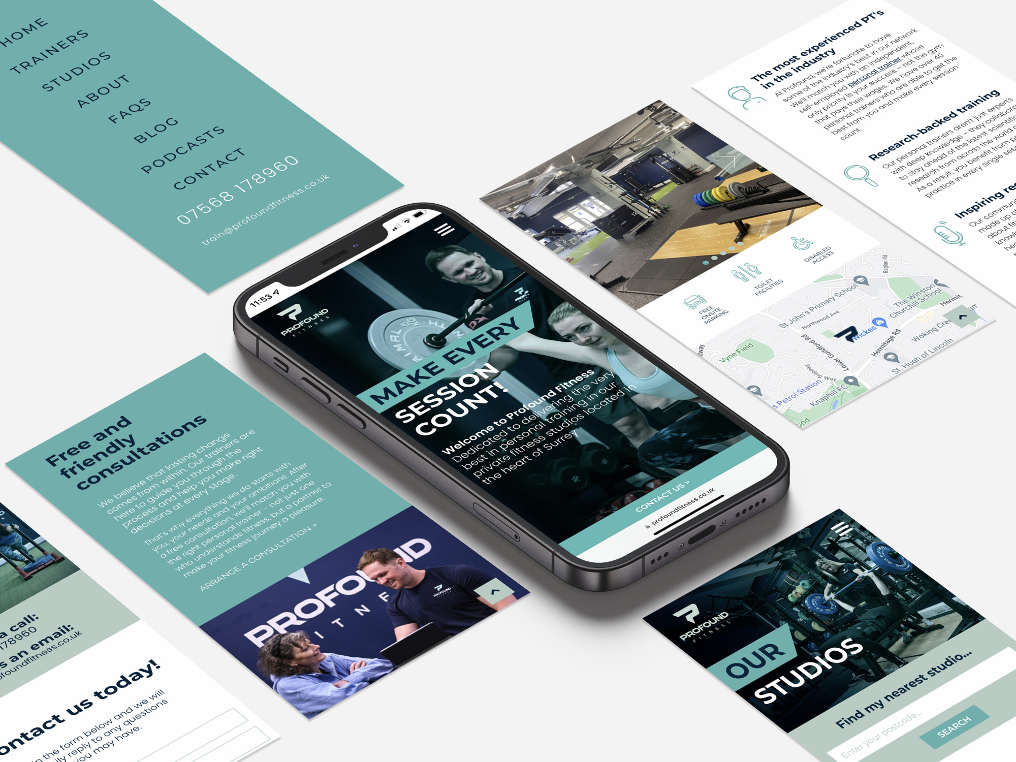
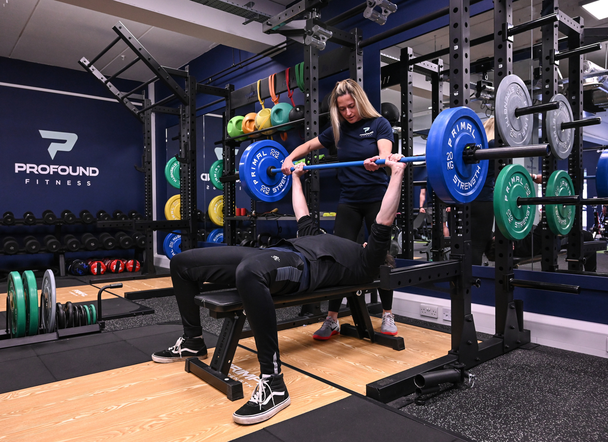
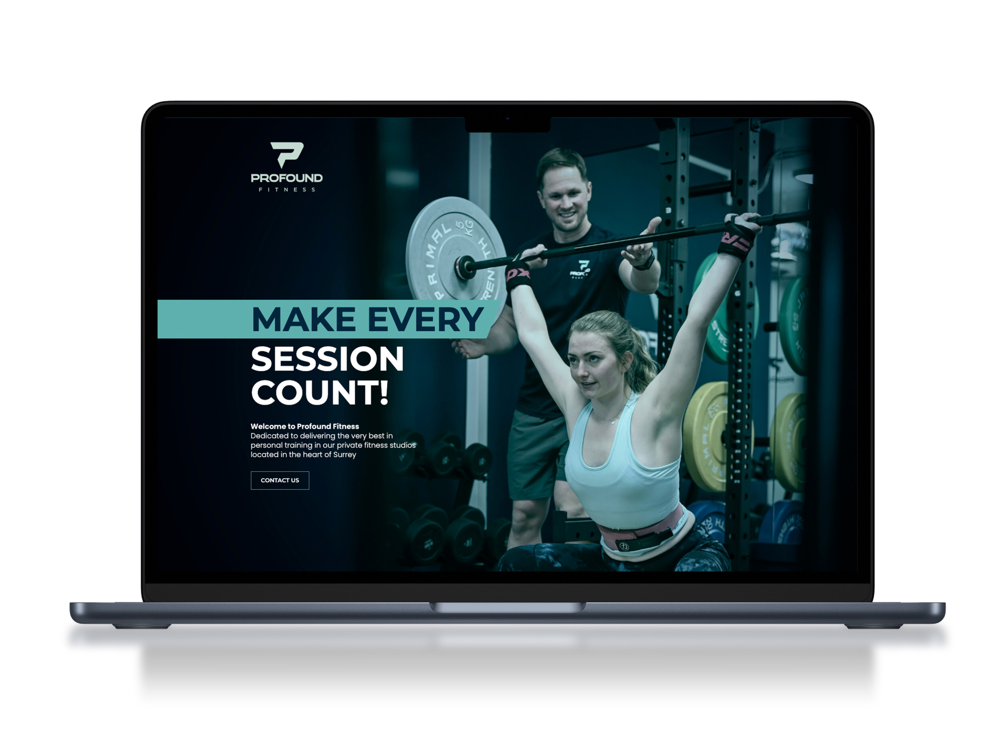
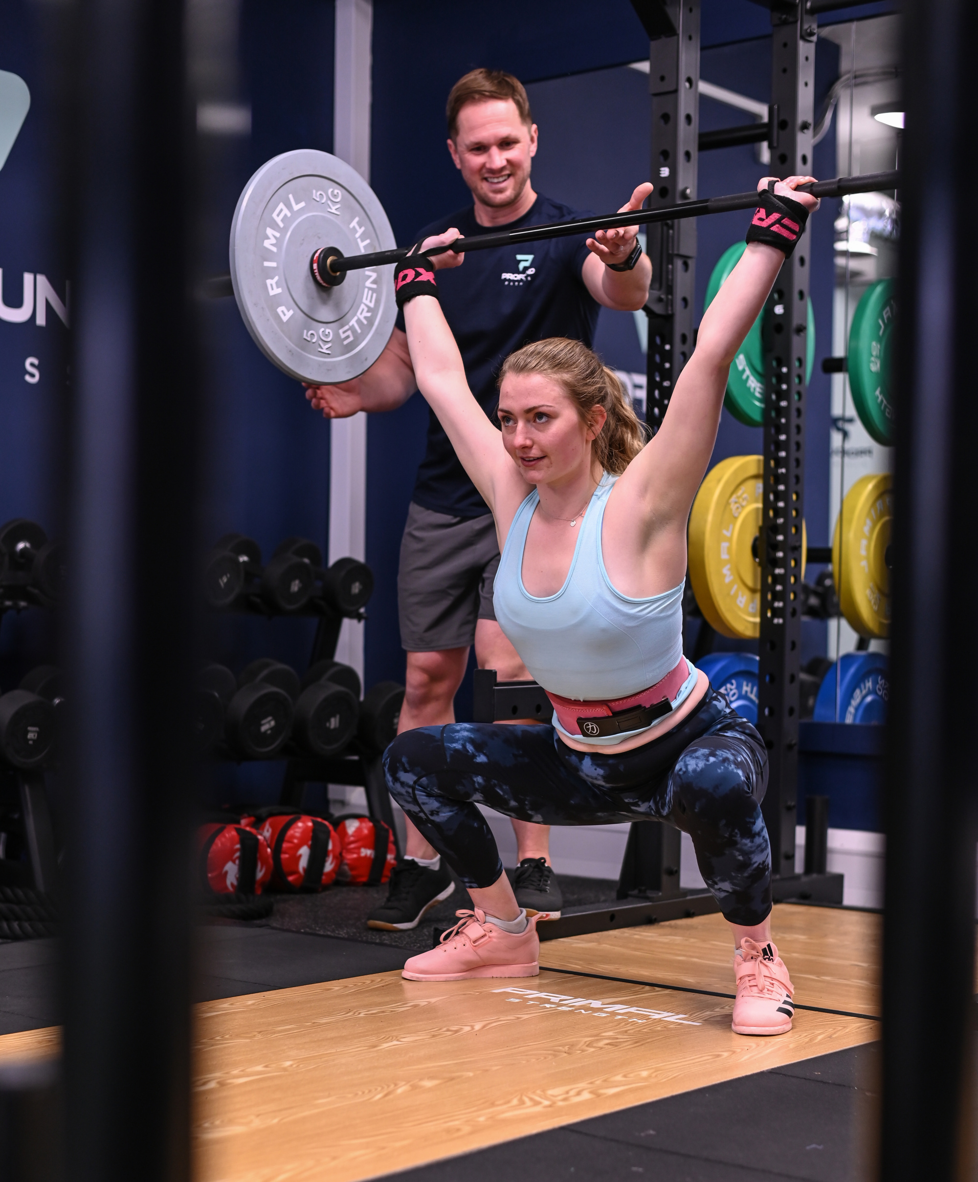
To create a brand for a new private personal training studio, that prides themselves on using only the very best personal trainers to get long lasting results for their clients. The logo was applied across a website, marketing materials, studio design and I was required to direct a photoshoot for the website.
SOLUTION
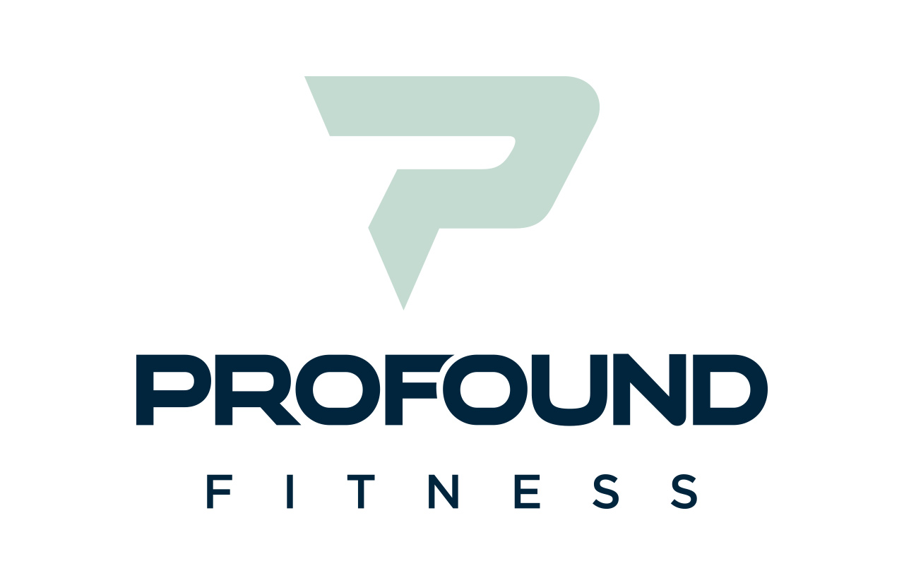
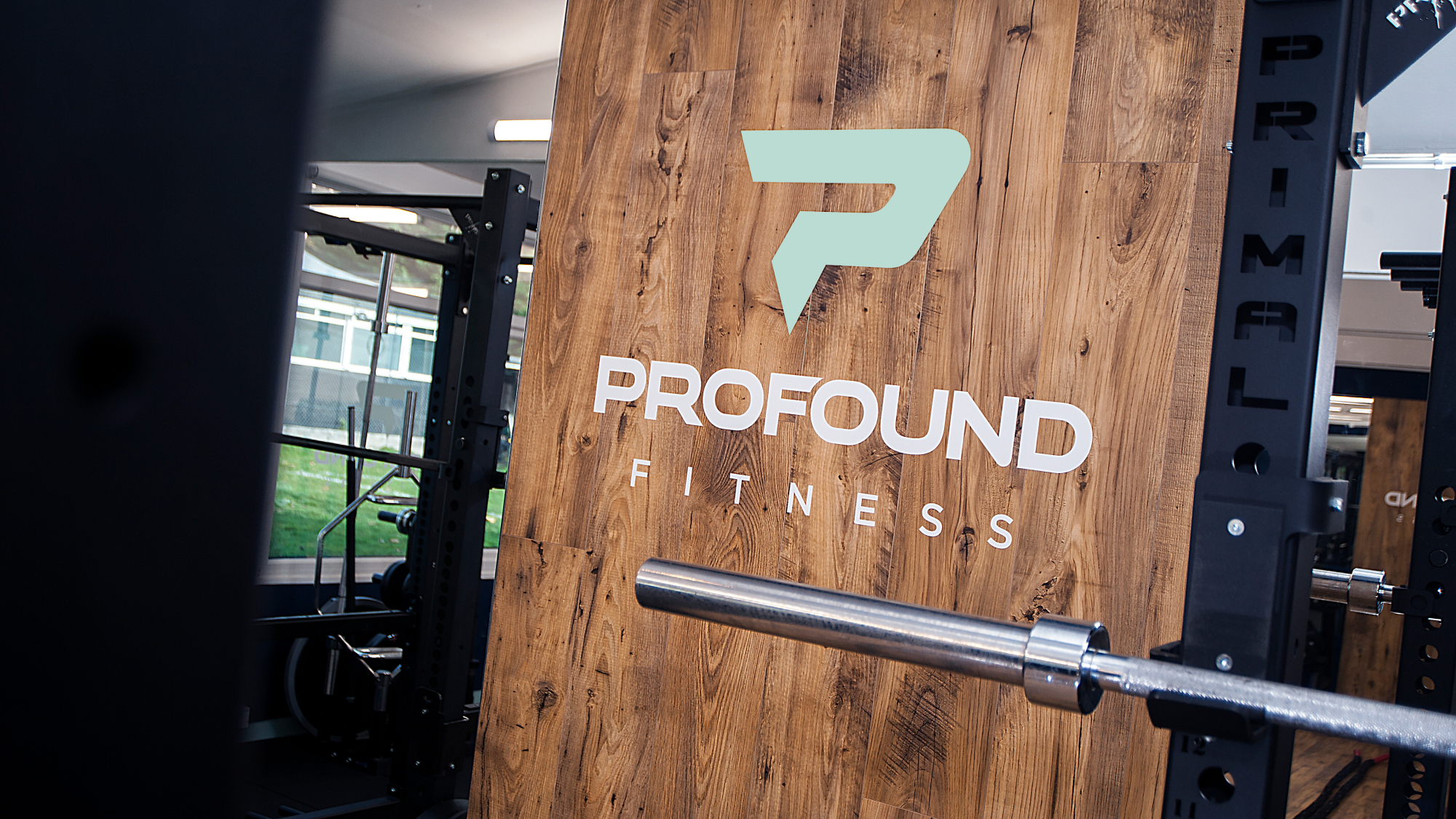
The Profound Fitness identity provides a feeling of strength, positivity and movement via the 'P' logo mark, in a style that is suggestive of a unique super hero. The navy blue and duck egg colours differ from your standard gym brands but create impact in a professional, sophisticated and friendly way allowing it to differentiate from competitors.
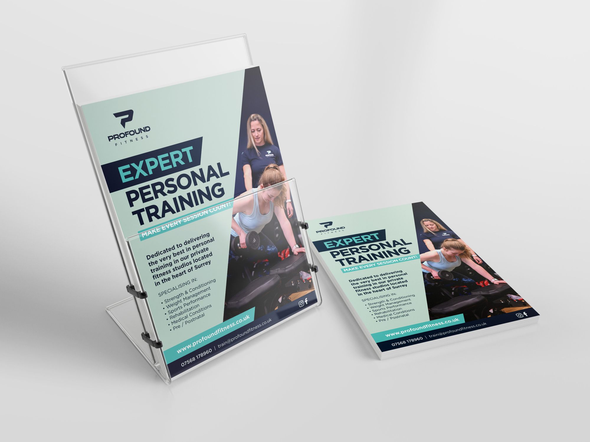
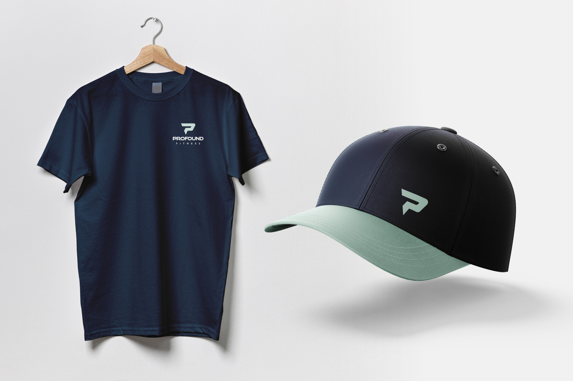
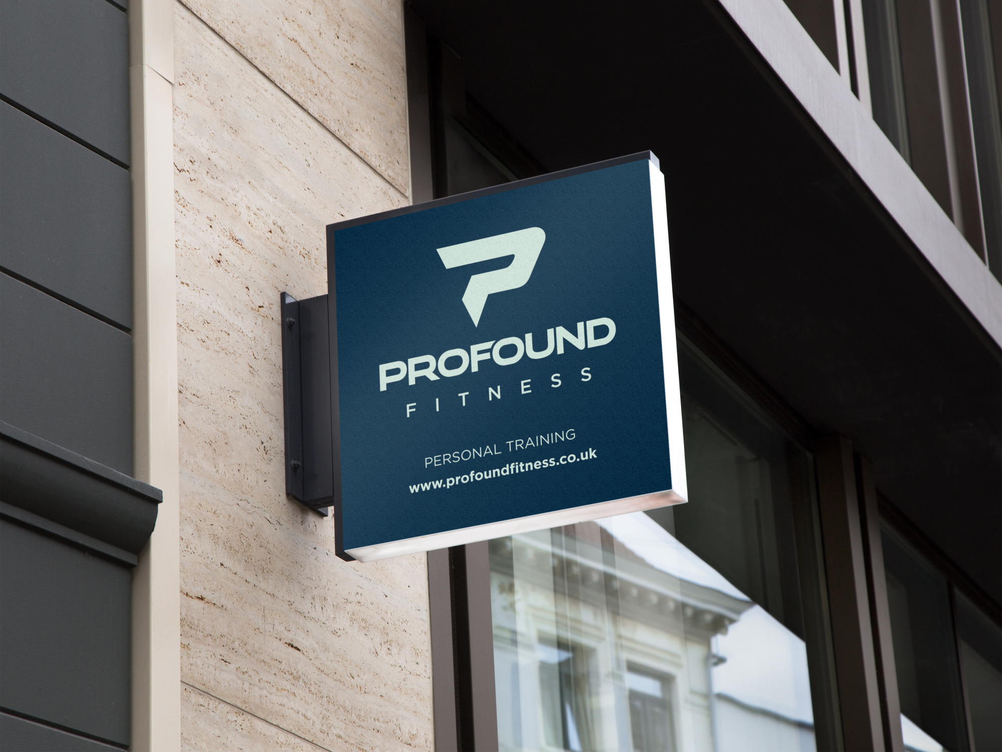
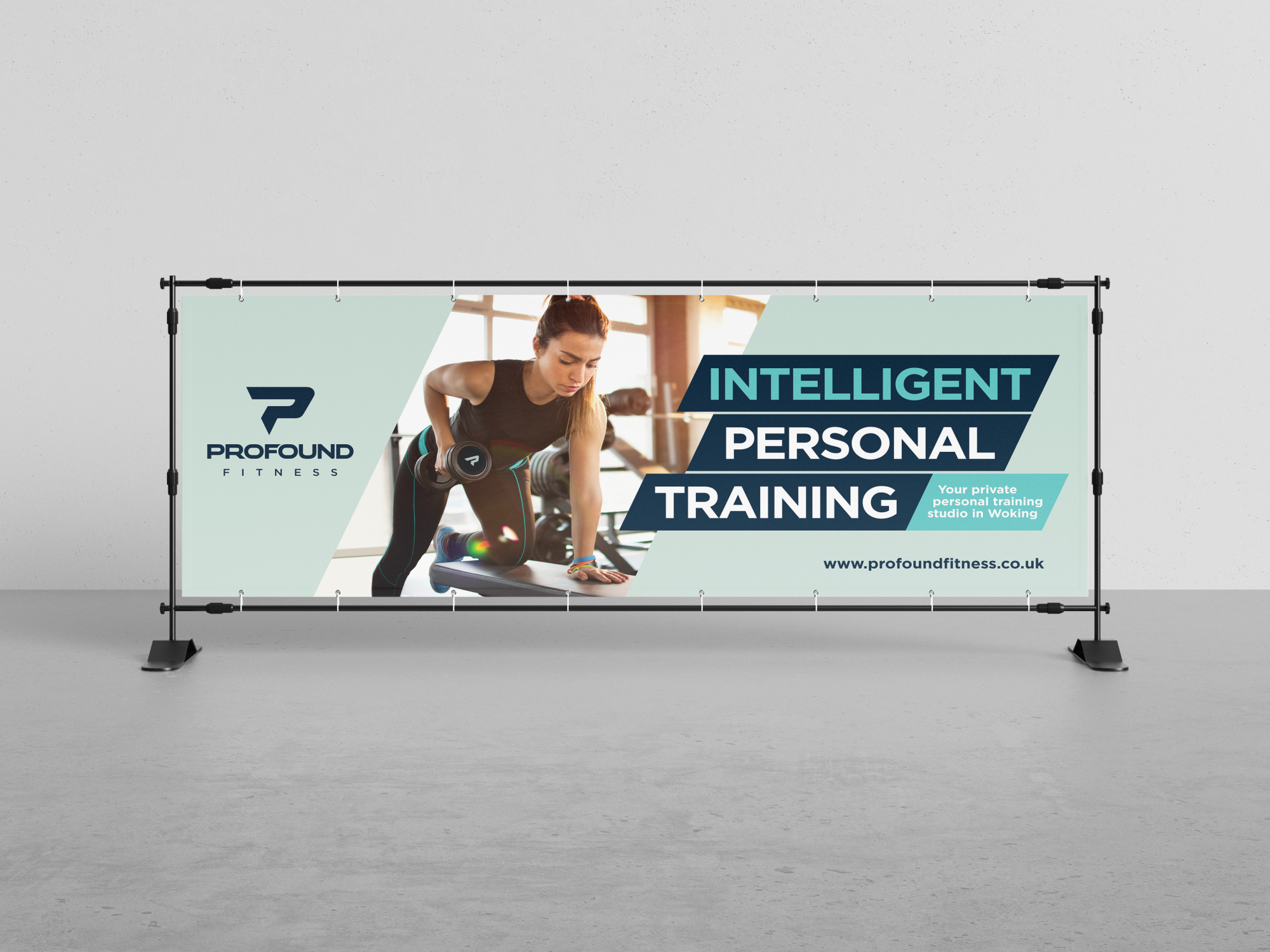
The roll out of the brand across marketing materials follows a direct visual link through the use in headings and key information, whilst maintaining a feeling of strength through the use of typography.
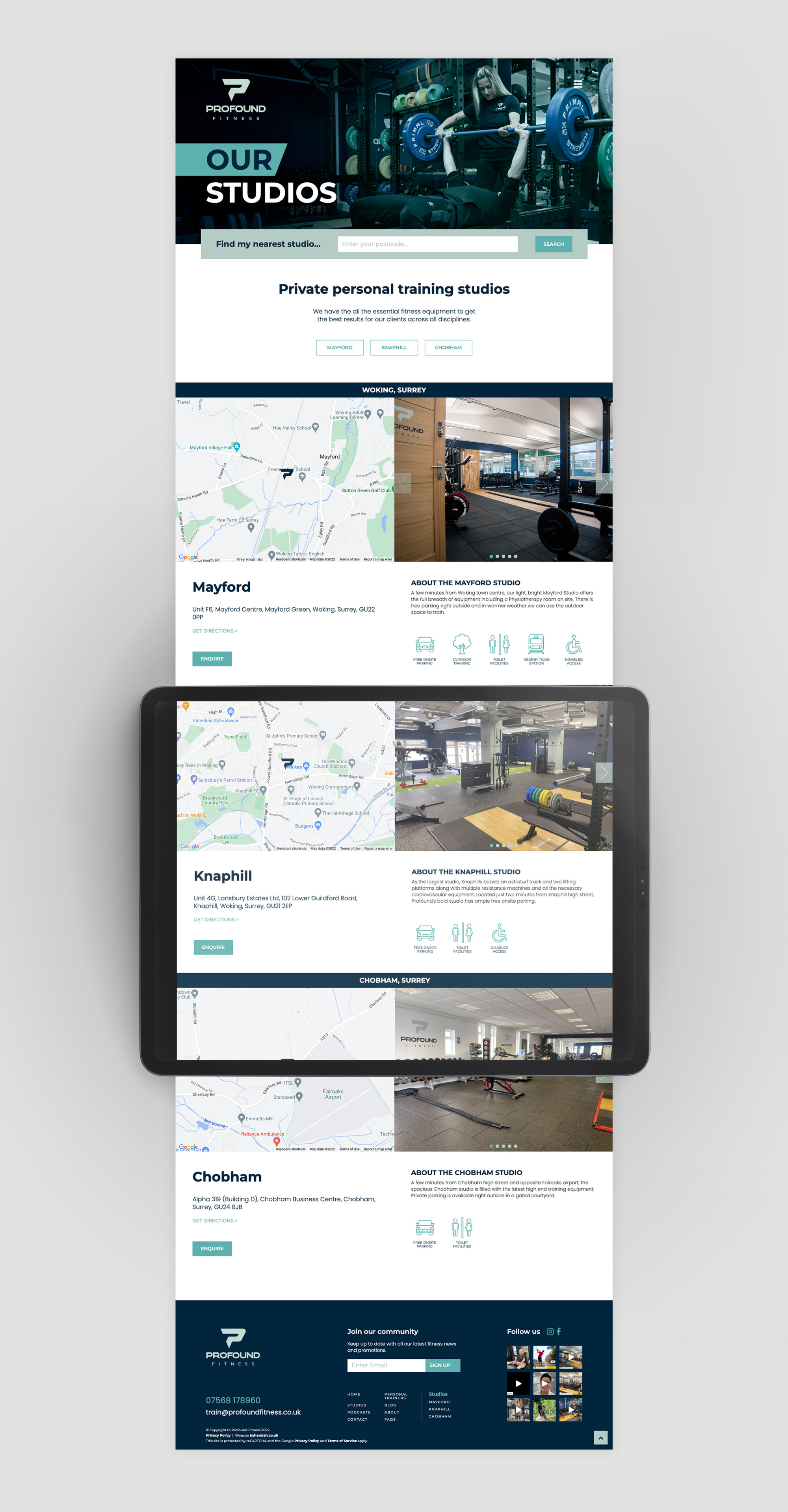
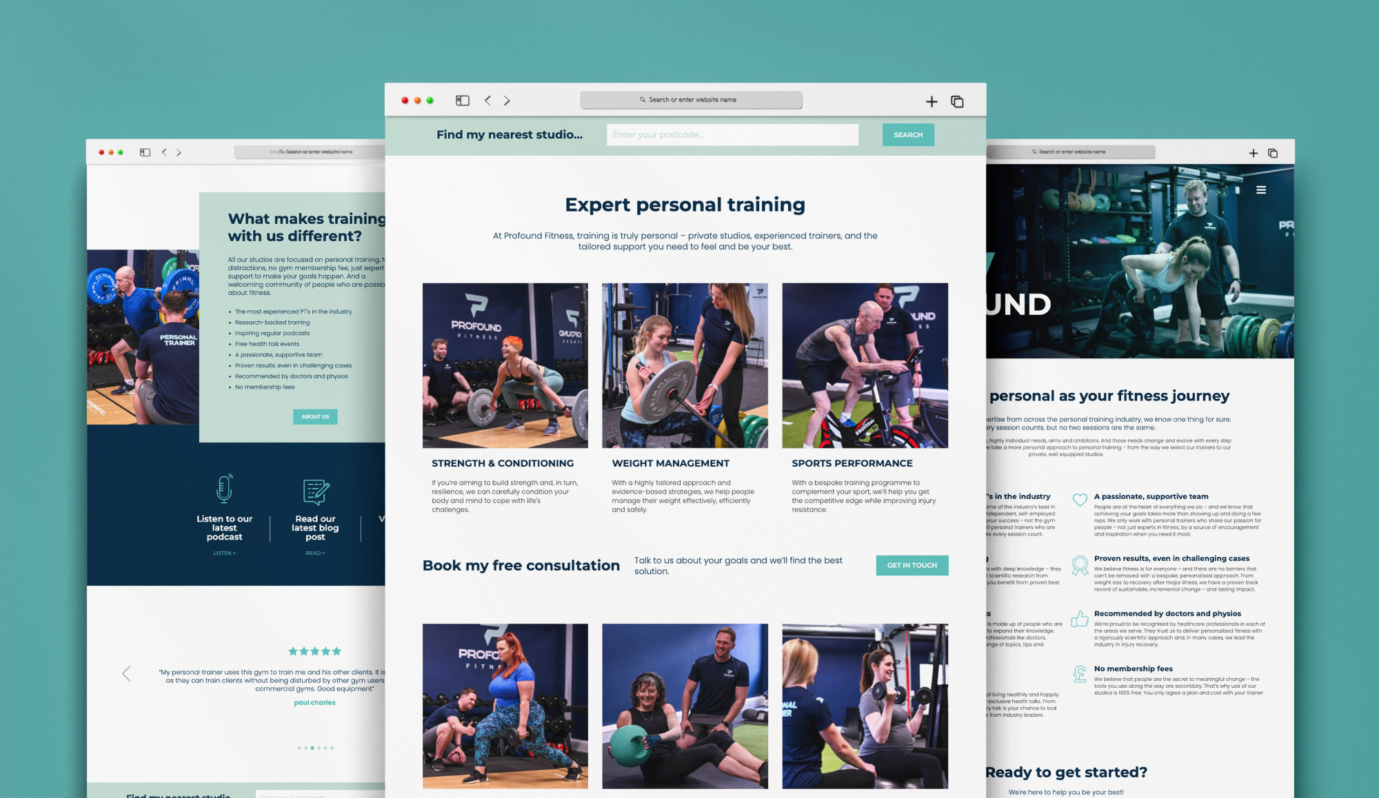
From the use of strong photography, the website highlights both the studios and the one to one training that is available at Profound Fitness and the user experience is concise and to the point with clear call to actions and buttons.
CREDIT
Own client.


