
BAC TO BEAUTY
BRIEF
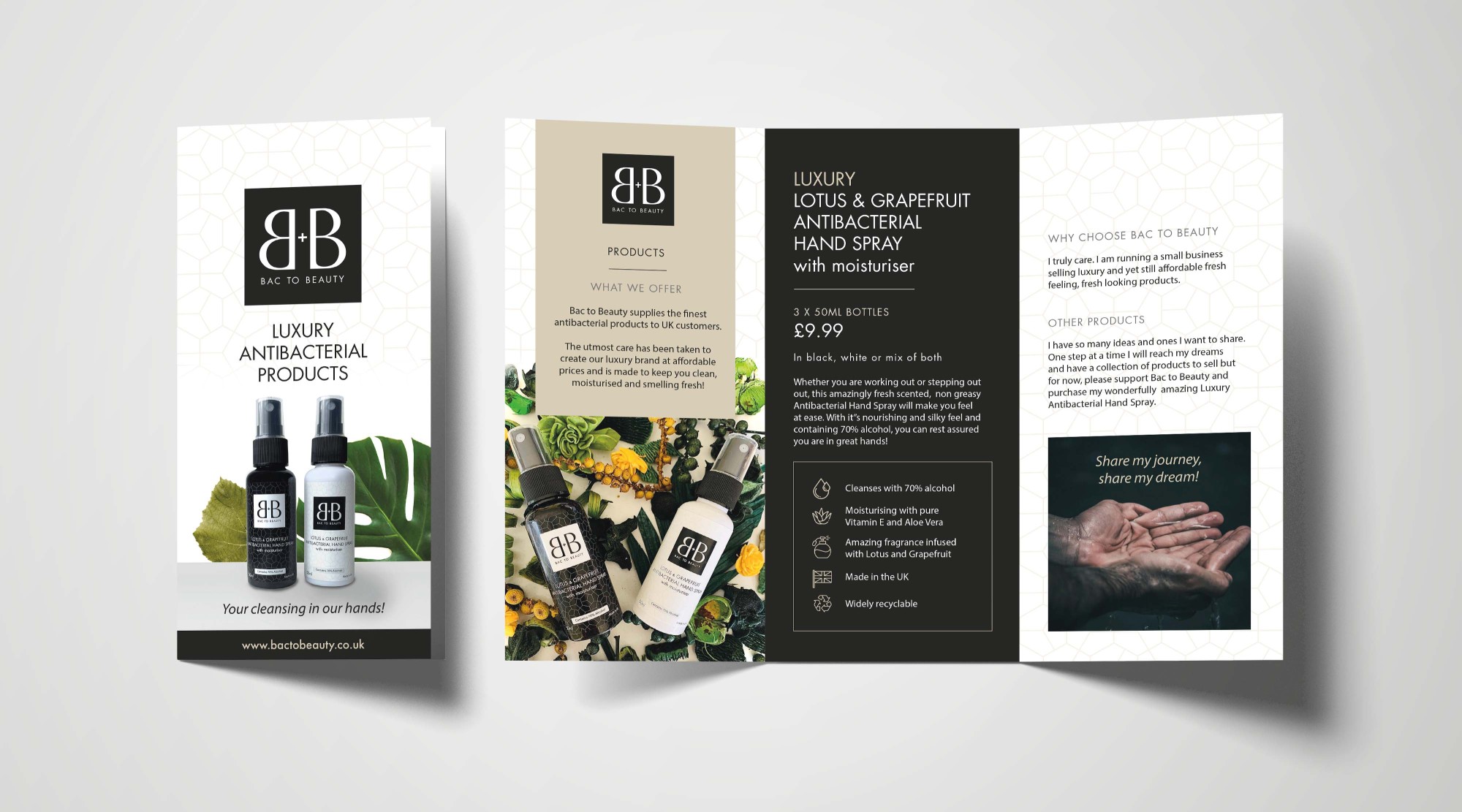
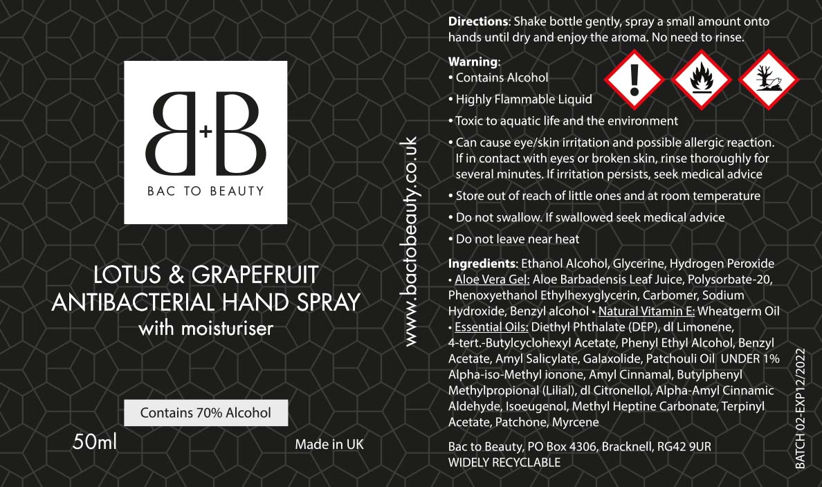
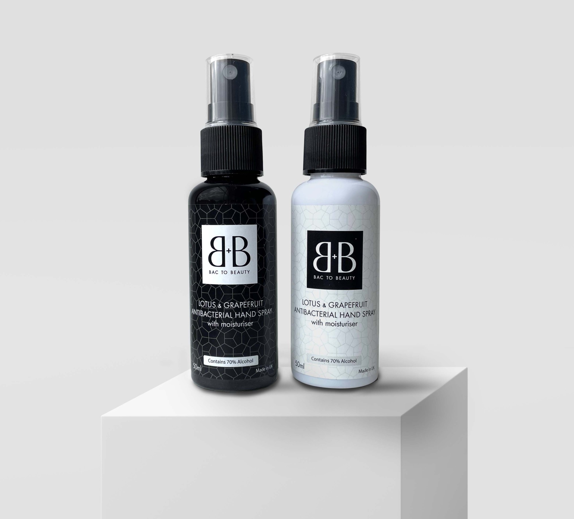
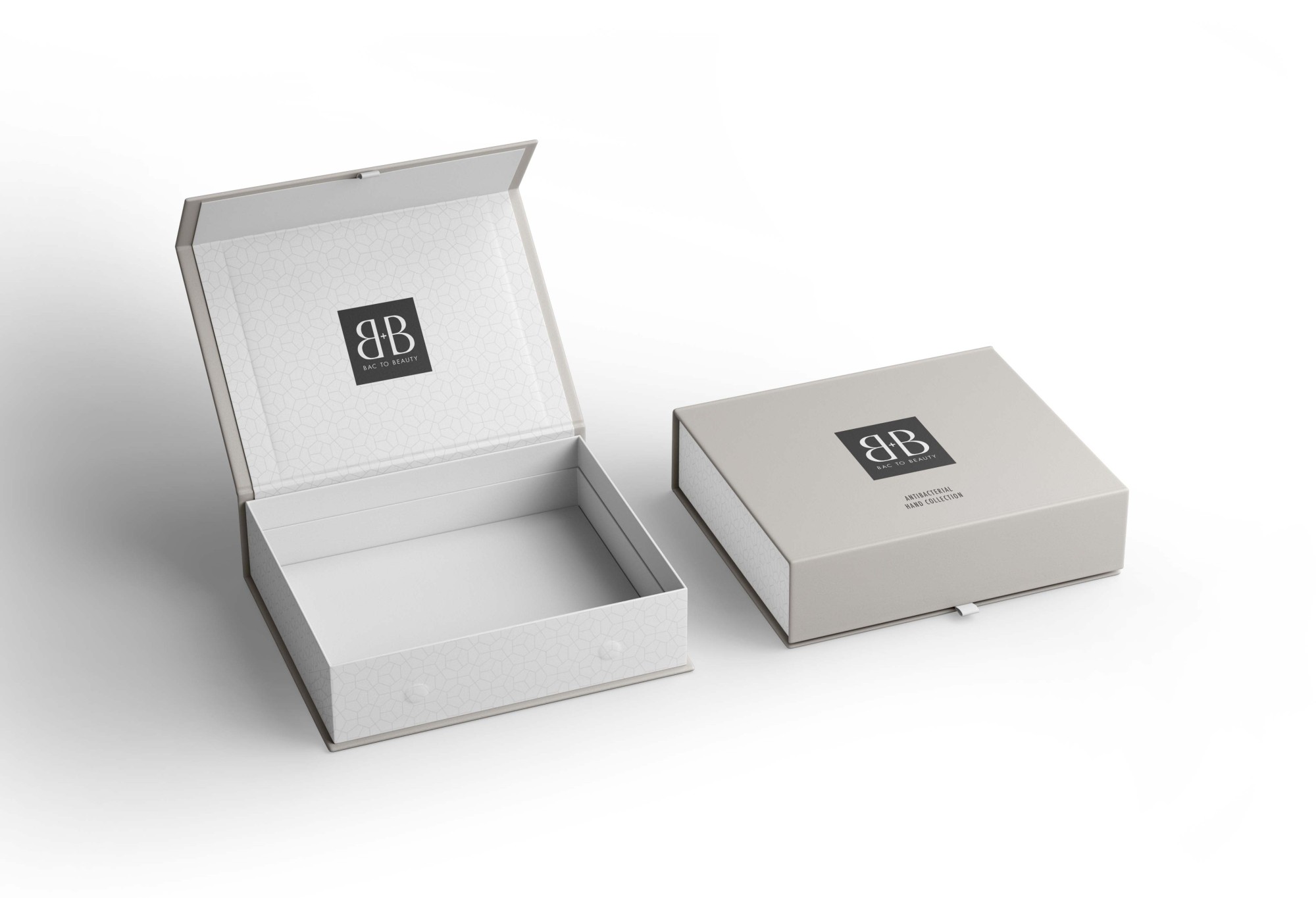
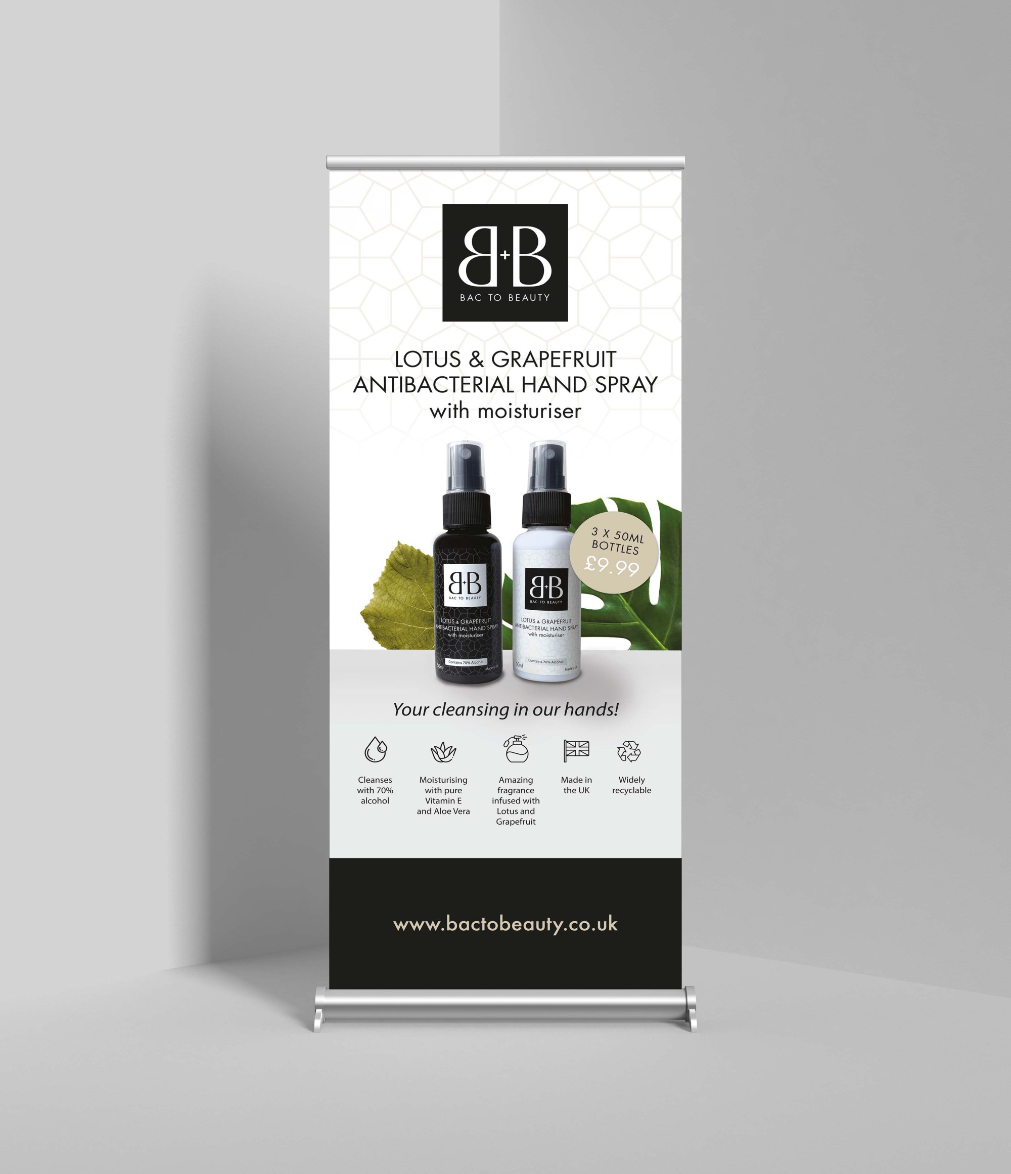
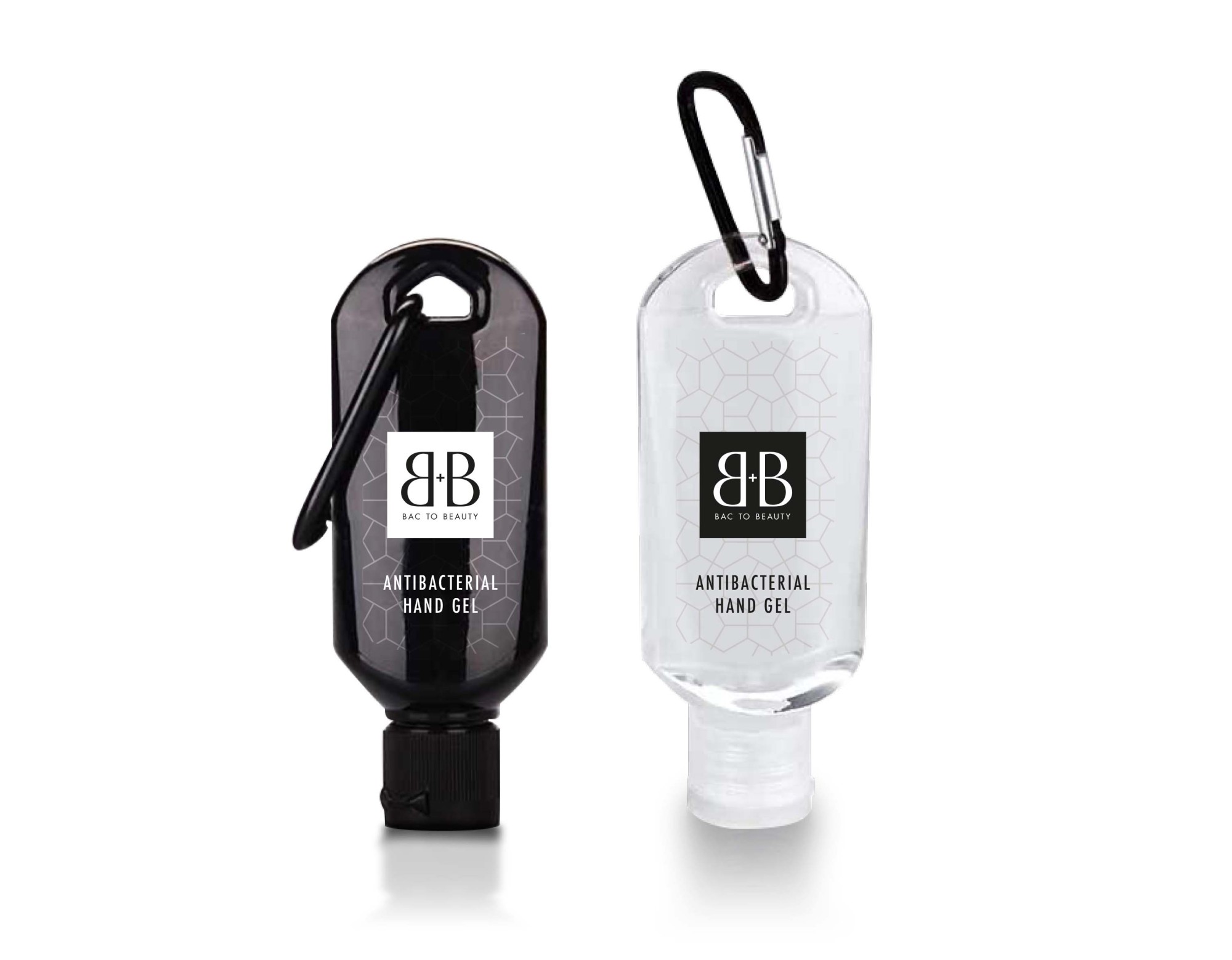
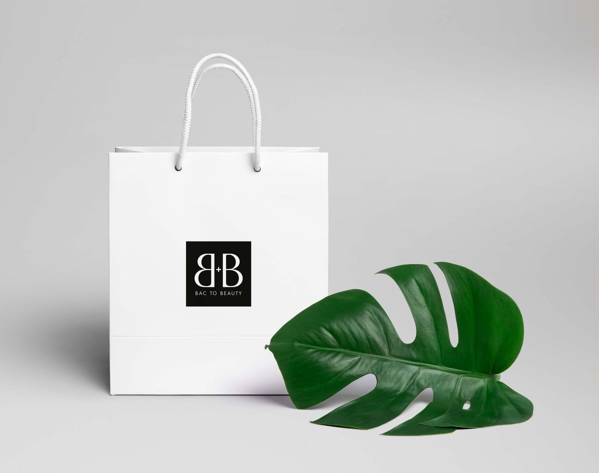
To create a brand for a luxury antibacterial hand sanitising company. This was then rolled out across a leaflet, packaging and pop up banner. The client wanted a premium look and feel to their brand, something where the product wouldn't look out of place at a wedding or conference, inside a designer handbag or around the house, but would stand out against competitors.
SOLUTION
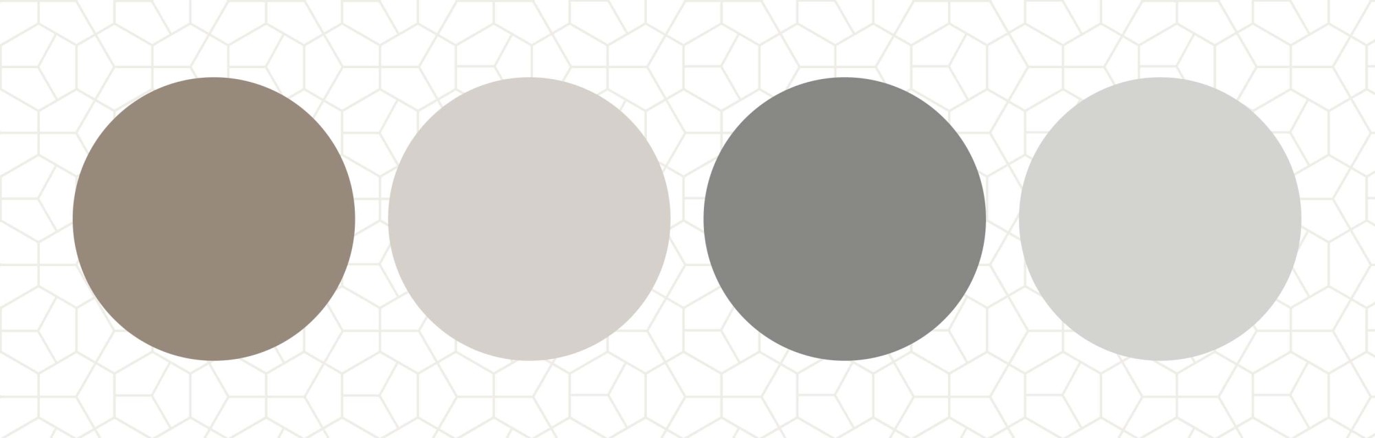
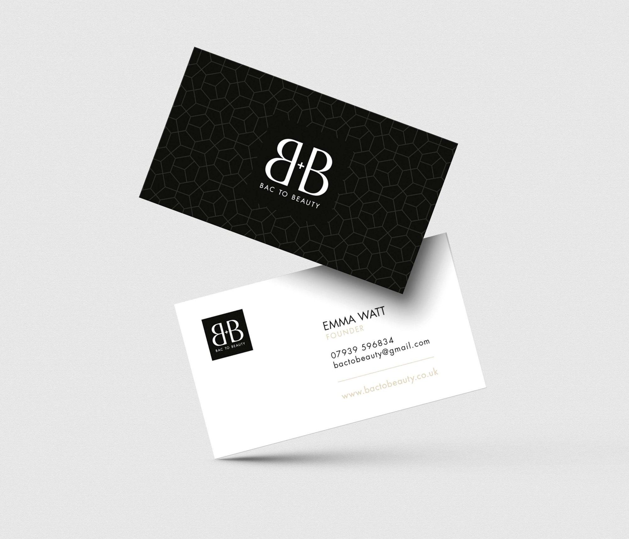
The Bac to Beauty brand is impactful yet refined in its approach. The boxed monochrome identity creates a bold focal point, whilst the letterforms are delicate and distinctive, which together creates a feeling of luxury and professionalism. The marketing collateral uses a mix of harmonious and warmer accent colours to break up and highlight key information. The subtle geometric pattern was created to represent skins cells and suggest a feeling of beauty and science in which the product helps to protect and soothe. The overall look and feel is clean, understated, luxurious and professional.
CREDIT
Own client.


